Thursday 12 May 2011

Meida Evaluation

Media Evaluation

  1. Our Brief at the beginning was to make two websites one of which would be a school website and the other a charity website. My First preliminary website, I began to research other school websites around my area, which would help me gain an idea on what to put into my website to make it look authentic and realistic. When looking and gathering specific information of other websites I found that many of them had a prime colour similar to the uniform, they also had a slide show of pictures showing the schools different attributes, from sports to lessons to the school itself. Once I had gathered this information, I started to draw out a plan of my website, as I went through my information I had gathered, I noticed that a lot of the sites had less colour and more information, which therefore seemed less inviting even though they had a slide show of photos it seemed they didn’t have any vibrant colours, also they school symbol is the representation of the school, but a lot of sights had this in a corner, scaled to small size. Taking these notes into consideration, I made sure that my website would have bright colours, be effortlessly to navigate around with links easy and accessible links, and with a bright logo which we be the representation of the school. The features I have imitated in order to persuade my visitors to go on my website was the banner showing the schools best features, a warm and welcoming message from the head teacher which will entice visitors to look more into the school as it shows a positive outlook that the head teacher is getting involved. The language I used on school website is formal but friendly to illustrate a sophisticated and etiquette school but with a pleasant and inviting way to influence parents to send their children to my school. With my second website which was my Charity one Named ‘Clarity’ I did the same research but based on blind awareness websites, as I focused on a website that helps blind people and their family’s. The features I used to make this website unique was a logo of a clear blue eye with the brand name over the top, relaxing music on the enter page, with also large easy to see links which provides enough information about the what they are trying to promote. We used the colours blue and pink, so it’s a multi-gender site, also blue represents clear and peace, and as well it links with clarity.

  1. When I was designing my school website I was aiming at both children and adults, as this website could be accessed by the students for home work on the VLE system, but also tell the parents about what their children have been up to by news updates and photos. I also wanted the site to be easy to navigate around, with pictures and information that makes the site inviting. With my charity website we wanted to know a specific age to aim at, so I created surveys and asked the public of what age would be acceptable to aim this charity website at, we gathered a variety of answers and the ages we got were12 to 80. The layout was bold and easy to navigate, we wanted to put voice navigation over the links to describe what they were clicking on but my lack of skills held me back from doing this, so if creating this site again I would look further into developing my knowledge and therefore being able to create it. The donation page was very convincing by having videos and pictures of people we helped, but also information on where their money will go and who we are going to help.

  1. To distribute our websites we chose the internet, rather than Radio, magazines or newspapers to advertise either my school or the charity website. We found through our surveys that the internet was the most popular one out of all the different institutions, so therefore I thought that distributing my websites through the internet would be the preferable idea. Using the internet is quite simple and doesn’t require excessive knowledge and skills when building a website. I find that the internet website is more personal as people can send emails to you and you will answer back to their question straight away, unlike magazines or newspapers who take a lot of time to respond to one letter or email because of the vast size of their production company. When managing a website, you do not need a immense amount of people setting it up, if you have the basic skills of web design. In Comparison with magazines you see that it takes hundreds of people working for them to set up one magazine per month.

  1. My charity websites audience was for blind people’s families helping their child feel wanted and to have fun at our charity fun raisers were they could interact with others in the same situation as them. My website reflects the needs of its audience by having friendly pictures which we discovered about when looking at other sights and using out surveys that audiences preferred a bright easy to use sight which gives an encouraging outlook. Accessible links which made the website easy and simple to navigate around without getting lost in to such a complex system. As well as a search bar and a comment box, this was an idea for people to comment on the sight and what they think it’s a more impersonal way or keeping touch with us and other people, to share experiences and thoughts about our events. My expectations of their response would be it is an easy sight with a lot of good information which gives us a positive feel. Through my website I try attract as many people as possible, even people who haven’t shared a disability. My survey helped me see what I needed to make my website clear and current with the times and what would attract a variety or people to it, by using my survey it made creating the website more simpler which gave me time to think about adding extra information to the site to compete with leading charity websites.

  1. On my charity website we used simple by informative language, so it would not confuse our audience on what information we was trying to put across, we made sure that the font and colour of our text was easy to read and stood out from the background colour, we did this by using a large font with a dark blue colour. We created a search box that lets people look for specific information, and a comment box that lets people leave their thoughts about upcoming events as well as what we could do to improve our website or facilities, this gets the audience interactive with the charity and makes them feel a part of it instead of just supporting it.

  1. With my school website my attitude to that was making sure it was accessible for both parent and child with select information about the school, the programs I used were Iweb, final cut express and iphoto, my first site was very basic as I have very little knowledge on how to use these programs to their maximum potential, therefore when I started creating my second website I learnt a lot more skills through the creation of my school, so I used them on my charity website, the skills I learnt was how make a film, add music and creating links and a layout which makes the website look more authentic. This evidentially gave my second website a more substantial quality.

  1. Throughout the whole process I have learnt many new techniques, from using photo shop when editing my photos, creating a website using I web, adding html codes, and layouts. Evidentially my first website had very little on it and I didn’t show my full potential but I think that the second website really showed my true colours and I have excelled my self on creating a accessible, well thought out, easy to navigate, fun sight. I am more confident at taking risks as well as experimenting with new layouts which I find came make the website look more professional. Overall I think my second website was the most successful than my preliminary website this is down to the fact I had developed and learnt more skills to experiment with for my second website.

Tuesday 3 May 2011

3rd March

this is how we created our eye logo:

 to create my eye, i firstly loaded up the picture i took earlier in the week and went to the select tool.

once selected all the picture i deselect the eyeris

 and the go too, image- hue and saturation


i then went to image adjustments black and white, with the picture still in select tool.


i then edited the colors


after deselecting this was the final outlook, which then became my logo.

Wednesday 20 April 2011

Final marking

Liz -
  1. I haven't got your website, so can't mark it.
  2. Your blog is more than a month out of date.
  3. The blog has very few illustrations and is a bit dull as a result. It should be creative as well as factual.
  4. It is really important that you make thorough use of the list on the front page of the website - download it and use it as a tick list.
  5. Hard work, please.
HM

Wednesday 9 March 2011

9th march

we looked at our webiste and compared it to other charity websites to see how we could improve it after moving various texts and images around we came to the conclusion that we needed a bright colour on it to we chose a pink banner which added a vibrancy to it. Also the white a blue show purity which refelts what our charity is about, 'seeing clear'

Tuesday 8 March 2011

Monday 7 March 2011

7th march

half way through the video and ive added work trasitions ona  black background to make stand out with rhetorcial questions to make viewer think.

Sunday 6 March 2011

6th march

we started gathering pictures to put on to the video to make it more outstanding i also started creating music to lap over the video.

6th march

today we sketched out a plan for a video

Saturday 5 March 2011

5th march

today i worked on what we do and the home page to make them really up to date and clear.

Friday 4 March 2011

4th march

today i started to develope other pages, like what we do, case studies, upcoming events, and others. i added our logo on all of them which makes it consistant and links, pluss information which is suitable for that page and links to pdfs the the types of conditions page, and slide shows witht music on top for the what we do page.

Wednesday 2 March 2011

2nd march

We went out a took more photos of which we could use on our site and for case studies, we went back and unploaded and edited them.

Tuesday 1 March 2011

1st march

in this lesson we finished of our hompage, we finally fished we a search tool, and a few links to social networking sights as we found out through our surveys that many people discover new information through this.

Saturday 19 February 2011

19 febuary

In this lesson we scaled down pictures of our logo set the opacity really low and added text over, this made our links seem more professional and reconizable for our audience and made the website fit instead of clash.

Friday 18 February 2011

18 febuary

Today we worked on our home page, adding text, pictures, slideshows and links. We also sorted out the colour scheme and made sure it was a good visable colour for our audience.

Thursday 17 February 2011

17 febuary

in this lesson we created our pages for the different links on the homepage and the links so it will be more accesible for people to move from page to page.

Wednesday 16 February 2011

16 febuary

In this lesson we thought we would adapt the work Clarity to look like water which we did on photoshop, and using a tutorial. We then loaded the writing on to the eye which we also photoshoped to creat our logo and the enter page picture to our website.


to create this we went on to this link- http://photoshop-dragon.com/Tutorials/Text_Effects/Wet_Text.htm

which we followed the instructions to create our text

here is our step by step guide on how we created Clarity


.

firstly i opened photoshop and a new project.
i then went to the handwriting tool, and then in lucinda handwriting font i wrote 'clarity'. i then adjusted the size.


i then went to layer- rasterize- type, this gives it a slight tilt
i then went to edit- transform- perspective
then i went to edit- rotate
Layer Style. Select Layer->Layer Style->Drop Shadow to bring up the Layer Styles dialog box.
i then clicked inner shadow and edited then to get my preferable writing.
i then went to bevel and emboss, adjusted it.
i ten clicked blending options and changed the levels to get a more suitable outlook.
To then create the water effect i went too Filter->Distort->Zig Zag which then i adjusted it to give it a little wave.
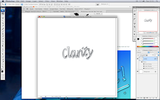
After everything this is how i created the water effect writing.

Tuesday 15 February 2011

15 febuary

We had a lot of spare pictures that, and found one that was significant to our website which was an eye, but we photoshoped it to the it was black and white but the iris was a light shade of blue, then we added text over the top to spell our name, Clarity.

Monday 14 February 2011

14 febuary

In this lesson we took out a camera and snapped various different people, then we uploaded them on to computer and edited them using photoshop. in the end we ended up using a few and not all of them

Sunday 13 February 2011

13 febuary

in this lesson we did the remainder of our pages as the site developed we began to this of other ideas that we could add to the sight

Saturday 12 February 2011

12 febuary

in this lesson we played around in 'iweb' looking at different fonts and , font styles that suited our site.

Friday 11 February 2011

11 febuary

in lesson we starting buliding our webiste on 'Iweb' we set up the page with the correct widths and heights on the page layout.

Thursday 10 February 2011

10th febuary

in this lesson we drew up sketches for our website  'Clarity' which will help us figure out what goes where, when building our website.

Wednesday 9 February 2011

9th febuary

we made a survey for 30 random people to find out what audience is for this website. we got a different variety of feedback which gave us a clear idea on who to aim this for.

Tuesday 8 February 2011

8th febuary

we looked at different sites to get an idea for ours, we decided of making a webiste dedicated to blind people. We looked at various webistes and we saw  what looks good and bad and we are going to be taking what we learnt and using it for our own website.

Saturday 5 February 2011

5th febuary

We was going through ideas for our next website, charity website, we was looking at different charity websites to get an idea of what to do.

Friday 4 February 2011

4th frebuary

in this lesson i touched up my website to make it more orginal to others and added a logo to my background which is faded.

Thursday 3 February 2011

3rd febuary

In this lesson i followed my designs and made my school site added a video which i took in the previous lesson i also edited it aswell.

Wednesday 2 February 2011

2nd febuary

In this lesson i booked a camera out and went around school taking photos, of which i uploaded and edited to go on to my school sight.

Tuesday 1 February 2011

1st Febuary

In this lesson i drew my premilary website on paper to construct on what i was going to do on the computers when coming to make my school website.

Friday 28 January 2011

28th of January

in this lesson we got taught how to use a digital camera and developing the pictures that will be taken to go on to my websites that i am creating.

Tuesday 25 January 2011

The list -

Hi Liz -
Quite a nice looking blog. Here's a check list to help you get the rest of your work blogged and so that you are up to date:

Creating your blog.
Using a camera introduction
Photoshop your picture/s and post to blog.
Research on four school websites: 400 words short essay.
Survey.
Catchup, including survey, annotated websites.
Draft brief for preliminary site.
Page layout.
Photoshop, first artwork.

HM

Tuesday 18 January 2011

18th January

In today's lesson i did some primary research on different school websites to get an idea for our website which we will design for out media assignment. What i focused on was the layout of the website, i.e. the shape and set out of the home page, how they position the texts and images, different links used and also interactive parts.

i looked at four different school websites. By doing this research my information on different schools have widened my knowledge on how to make a good website.

The first website i looked at was Bishop Justice School http://www.bishopjustus.bromley.sch.uk

On the home page of this website, we see a banner with three pictures fading into one another all on a timer loop, we also see their website colors are related to the uniform which is purple. They also have their logo, and large pictures which relate to which link you will be going too.

The second website i looked at was Bullers Wood School http://www.bullerswood.bromley.sch.uk/

On the Home page of this website, they have a slide show of pictures about the students activities, they also have a banner of the school logo and part of the blazer with the title 'bullers wood school' overlapped. They also have links and information on this page.

The third website i looked at was Newstead Wood School http://www.newsteadwood.bromley.sch.uk/

 On the Home page of this website, its a very basic website with green and white backgrounds and links. there is also a slide show showing the different activities students can endure.

The last website i looked at was Bromley High School http://www.bromleyhigh.gdst.net/

With the bromley high home page we see their site colors which represent their uniform, we see a slide show and links very basic site.


Monday 17 January 2011

17th January

Today we was introduced to photo editing using a program called photoshop. We edited out photos so we convey the messages of the picture in an more artistic way. The picture i chose to edit was the one where there are four girls behind bars, i used a filter to make it look more cartoon and to portray a trapped scenery.

This is the photo i edited.

Friday 14 January 2011

14th January

Today's lesson we was given a camera to take photos of different people portraying different feelings and emotions, from happy, sad, angry and crazy. As we walked through the school our ideas on the concept of different emotions started to develop. firstly we started taking photos n the hall against a piano to gather a good light condition, then we moved outside where the light balance was considerably better and more props where used. To convey sadness we found black rails which signified trapped as we positioned a line of people behind it and hold on to the bars.

Charity Website breif

Thursday 13 January 2011

13 January

In todays lesson we was introduced to the practical concept of Media. What we learnt was how to set up a blog and too keep recognition of our work through this section of the course.

Preparation and planning


This is the link to the page with everything for Planning and Preparation: this is 20% of your mark, ie two whole grades.
http://web.me.com/morrmedia/MORRMEDIA/Website_planning_and_preparation_list.html
Make sure everything is ticked off. There are also lists on the wall in the media room.
On Monday you should have shotlists, storyboard (for your video), survey completed, six annotated pages completed.
HM